Make It Personal By Creating a Monogram: Part 1, Etiquette and Style
Share
What is proper monogram etiquette exactly? Which initial goes first? How do different size letters effect the order of the initials? What font should you use? Where should a monogram be placed on the article? How should you modify the style of the monogram to suit the occasion? With this blog, I hope to answer some of those questions for you and get you started personalizing your own items and adding that extra something to the next gift you give.
In this blog I will discuss placement, style, size, fonts and embellishments. Then, I'll follow up with Part 2, Monogramming Software and Machines and take a look at some of the machines available at your local Rocky Mountain Sewing and Vacuum store that will help you create the perfect, proper monogram.

Traditionally, single letter monograms represent the surname (i.e., last name). That goes for both men and unmarried women. However, children usually identify with their first name much sooner than their last name, so an informal gift for a child or a teenager may use the initial of his/her first name or nickname.

The two letter monogram usually combines the first and last initials of one person. Once again, exceptions can be made. Some married couples enjoy using an informal monogram that combines the first initials of bride and groom (no last initial).
The three letter monogram is probably the most classic of traditional monograms. Here are some basic guidelines for the most common examples.

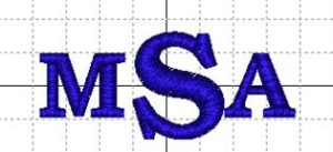
For a single person, the etiquette of a monogram is the same regardless of gender or age. However, the order usually depends upon the format of the monogram itself. First, for a format that uses a larger size for the last name initial, position the last initial in the center.

Alternatively, when the monogram format uses the same size letters for all initials, position the the last initial at the end.
When a couple weds, there are several options for appropriate monograms. The most obvious choice is a joint monogram including the initials of both the bride and the groom.

The question of whose initial should go first in a joint monogram is hotly-contested by a cadre of etiquette authorities. Traditionally, the groom’s first initial is first, followed by the joint last initial, then the bride’s first initial. Due to the connotations of “ownership” implied by the traditional method, the philosophy of “ladies first,” is gaining popularity. However, you can always take the stand that the bride is always “right” and continue to place her initial to the right of the groom’s.
A married woman’s monogram depends not only on the adoption of her husband’s last name but the fate of her middle initial. Traditionally, many women chose to use their maiden name in place of their middle name after marriage. Other women may elect to keep their middle name intact. Check with the recipient of the monogram to determine whether to use their middle or maiden name.
Unfortunately, certain combinations of initials are not well-suited to some monogram layouts. For example, you should probably create a three letter monogram for George Oliver Douglas with the last name in the middle (GDO), rather than a three letter monogram with first, middle, last in a row : GOD.
Here one, two or three initials of a person’s name are written in upper or lowercase in a straight line. If using a three letter monogram, make the center letter slightly bigger.

This monogram has first initial and middle initial stacked on top of each other on the left side of the last name initial which is big – it can be made in lowercase or uppercase letters .

The initials are curved in a shape – oval, circle or diamond and are often framed by that shape. The last name is in the middle.
The letters are designed so that parts of them intertwine.

To test out the correct placement of monogram, print out the monogram, cut it out and position it on the item. This helps ensure that the placement is to your preference. Another thing that is important when choosing the placement, is the ease of embroidering. Make sure you can stabilize and hoop the area to be monogrammed.
Monograms are usually placed on the left front of shirts and jackets. You can also place a monogram on shirt cuffs, collars and the left forearm. Some jackets have them on the lining.
Garment placements shown here are for medium and large adult clothing, and you may need to be adjust them slightly due to garment size. Obviously, you need to make adjustments in both size and placement for youth and infant sizes. When possible, try the item on the wearer to help determine placement. Some view monogrammed clothing as pretentious. Thus, it is usually best to be subtle, especially when monogramming men's shirts.
Click on this link to view a table that details sizes and placements for bed, bath and table linens.
A font is the type of lettering you use (typeface). Most embroidery machines have several built in fonts and embroidery programs also have “stock” fonts available to incorporate into your designs. Depending on the editing software you use, you may be able to create embroidery lettering with fonts that are installed on your computer (i.e. true type fonts). So, there are literally hundreds, if not thousands, of font styles available for creating monograms. Block fonts are more modern and masculine while script fonts are more feminine and elegant.


You ca n add more interest to a monogram by framing or embellishing with "whiskers". You can also make the design more subtle by sewing the monogram in a thread color close to the color of the article you are monogramming (tone on tone).
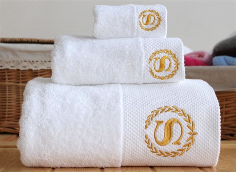
A monogram adds personal and traditional details to many sewing projects, including home décor, totes and bags, and articles of clothing. Monograms make nice things nicer. Most anyone can appreciate that little “extra something” a well-chosen personalization gives.
In Part 2, Monogramming Software and Machines, I'll show you some of the wonderful machines available at Rocky Mountain Sewing and Vacuum that make monogramming a snap. I'll also provide some links to monogram designs from some of our suppliers.
In this blog I will discuss placement, style, size, fonts and embellishments. Then, I'll follow up with Part 2, Monogramming Software and Machines and take a look at some of the machines available at your local Rocky Mountain Sewing and Vacuum store that will help you create the perfect, proper monogram.
Letter Placement
Single Letter Monograms

Traditionally, single letter monograms represent the surname (i.e., last name). That goes for both men and unmarried women. However, children usually identify with their first name much sooner than their last name, so an informal gift for a child or a teenager may use the initial of his/her first name or nickname.
Two Letter Monograms

The two letter monogram usually combines the first and last initials of one person. Once again, exceptions can be made. Some married couples enjoy using an informal monogram that combines the first initials of bride and groom (no last initial).
Three Letter Monograms
The three letter monogram is probably the most classic of traditional monograms. Here are some basic guidelines for the most common examples.
Single Person

For a single person, the etiquette of a monogram is the same regardless of gender or age. However, the order usually depends upon the format of the monogram itself. First, for a format that uses a larger size for the last name initial, position the last initial in the center.

Alternatively, when the monogram format uses the same size letters for all initials, position the the last initial at the end.
Married Couple
When a couple weds, there are several options for appropriate monograms. The most obvious choice is a joint monogram including the initials of both the bride and the groom.

The question of whose initial should go first in a joint monogram is hotly-contested by a cadre of etiquette authorities. Traditionally, the groom’s first initial is first, followed by the joint last initial, then the bride’s first initial. Due to the connotations of “ownership” implied by the traditional method, the philosophy of “ladies first,” is gaining popularity. However, you can always take the stand that the bride is always “right” and continue to place her initial to the right of the groom’s.
Married Woman
A married woman’s monogram depends not only on the adoption of her husband’s last name but the fate of her middle initial. Traditionally, many women chose to use their maiden name in place of their middle name after marriage. Other women may elect to keep their middle name intact. Check with the recipient of the monogram to determine whether to use their middle or maiden name.
Beware!
Unfortunately, certain combinations of initials are not well-suited to some monogram layouts. For example, you should probably create a three letter monogram for George Oliver Douglas with the last name in the middle (GDO), rather than a three letter monogram with first, middle, last in a row : GOD.
Types of monogram designs
Straight Monogram
Here one, two or three initials of a person’s name are written in upper or lowercase in a straight line. If using a three letter monogram, make the center letter slightly bigger.
Block Monogram

This monogram has first initial and middle initial stacked on top of each other on the left side of the last name initial which is big – it can be made in lowercase or uppercase letters .
Curved Monogram or Shaped Monogram

The initials are curved in a shape – oval, circle or diamond and are often framed by that shape. The last name is in the middle.
Interlocked Monogram
The letters are designed so that parts of them intertwine.

Placement and Size
To test out the correct placement of monogram, print out the monogram, cut it out and position it on the item. This helps ensure that the placement is to your preference. Another thing that is important when choosing the placement, is the ease of embroidering. Make sure you can stabilize and hoop the area to be monogrammed.
Monograms are usually placed on the left front of shirts and jackets. You can also place a monogram on shirt cuffs, collars and the left forearm. Some jackets have them on the lining.
Placement Table
Garment placements shown here are for medium and large adult clothing, and you may need to be adjust them slightly due to garment size. Obviously, you need to make adjustments in both size and placement for youth and infant sizes. When possible, try the item on the wearer to help determine placement. Some view monogrammed clothing as pretentious. Thus, it is usually best to be subtle, especially when monogramming men's shirts.
| ITEM | SIZE | PLACEMENT | GENERAL REFERENCE |
| Shirt cuffs | 0.5” to .75” | Top center of wrist. The bottom of the letters should fall at the bottom of the cuff |
Start 1” from the center of the cuff toward the buttonhole and 1/4” to 1/2” above cuff edge |
| Ties | 0.5” to .75” | Centered on bottom tip unless worn with a vest |
1 1/2” to 2” up from the bottom tip; 9” to 11” up from the bottom tip when worn with a vest |
| Shirts with design on left side. | 3.5" x 3.5" | Centered between front placket and sleeve seam below left shoulder |
7 1/2” to 9” down from the left shoulder seam and 4” to 6” over from the center front for men; 4” to 6” down from the left shoulder seam and 3” to 5” over from the center front for women |
| Jacket front | 3.5" x 3.5" | Centered between front placket and sleeve seam below left shoulder |
3 1/2” to 4” over from the center and 6” to 8” down from the shoulder seam |
Click on this link to view a table that details sizes and placements for bed, bath and table linens.
Fonts
A font is the type of lettering you use (typeface). Most embroidery machines have several built in fonts and embroidery programs also have “stock” fonts available to incorporate into your designs. Depending on the editing software you use, you may be able to create embroidery lettering with fonts that are installed on your computer (i.e. true type fonts). So, there are literally hundreds, if not thousands, of font styles available for creating monograms. Block fonts are more modern and masculine while script fonts are more feminine and elegant.
A Few Things to Consider
- Do you like florals, geometrics, or abstract design? Do you prefer the style of traditional design, contemporary, modern or 1940's retro design?
- Where are you using your monogram items? On bed linens, bath linens, guest towels, table linens or for your trousseau? What is the style of your china and silver pattern?
- Consider how the letters will appear. Some letters may look just like you want them to, while some letters might be difficult to read with certain fonts. In this example, the Old English font used here, may not be the best choice for William, as the W is hard to make out.

- While a highly decorative script font may look just fine on its own, it could be extremely difficult to read when used in traditional three-letter monograms.

- A casual or "funky" font would not be appropriate for monogramming formal table linens. Likewise a formal script may not be the best choice for monogramming a toddler's shirt. So make sure the font fits the occasion.
- When giving a gift, consider the style and preferences of the recipient.
Embellishments


You ca n add more interest to a monogram by framing or embellishing with "whiskers". You can also make the design more subtle by sewing the monogram in a thread color close to the color of the article you are monogramming (tone on tone).
A monogram adds personal and traditional details to many sewing projects, including home décor, totes and bags, and articles of clothing. Monograms make nice things nicer. Most anyone can appreciate that little “extra something” a well-chosen personalization gives.
In Part 2, Monogramming Software and Machines, I'll show you some of the wonderful machines available at Rocky Mountain Sewing and Vacuum that make monogramming a snap. I'll also provide some links to monogram designs from some of our suppliers.